Hey, it’s Brady,
Need some fresh inspiration for a new season?
Here are the 5 design trends I can’t get enough of this Spring…
Trend #1: Chunky Fonts & Buttons

Design by https://htb.org/
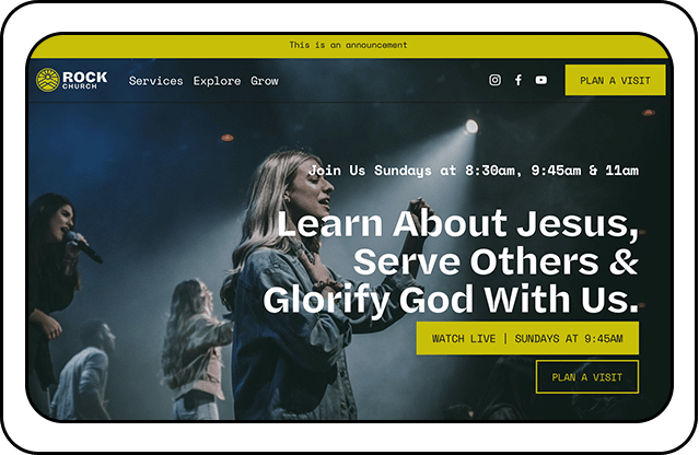
Holy Trinity in London and their website htb.org are a perfect example of this. Thick type. And even thiccer buttons. Specifically, if you visit this website on mobile, the buttons in the hero section are quite tall. This isn't how you'll see buttons typically styled. But I'm here for it.
As for the font, HTB is using GT Walsheim Ultra Bold.
Now, I'm a real sicko for a thick font. If you head to my Instagram @bradyshearer, you'll see the covers on my carousels are all high-contrast with thick type against plain backgrounds.
The font I use on these carousels is the Pro Church Tools brand font Neue Haas Grotestk in the Black weight. But, because I'm a menace. I actually make additional modifications to this typeface. Because when a font isn't thick enough, I'll actually go into Photoshop and add an additional stroke, in this case about 5-10 pixels.
And if you're looking for other chunky font options check out Humane V.2.0 and Thunder which is a great free option.
Trend #2: Mono Fonts

Designs by me
This is the trend I’m gonna champion all by myself.
Using a mono font as your secondary brand font. The fonts used in the designs above are DM Mono, Akkurat Mono, and Ki Monospace.
And if you're curious, what is a mono font? The name mono comes from the design of the typeface because each character occupies the same amount of horizontal space.
Monospaced fonts were widely used in early computers. Also typewriters. And so they have a nostalgic feel to them. And I love using something that reminds people of decades past in modern designs. That's fusion. It's fun.
This week I saw the new A24 film Civil War and the font they used in the credits? A mono font.
THIS IS A MOVEMENT. 🎉

The end credits for A24’s new film, Civil War, using a mono font
Trend #3: Pop Of Color
This design trend is inspired by the fashion world.
Because most outfits are comprised of neutral colors: black, white, greys, browns, navys, etc. 🧥
One easy way to experiment with color is to use an accessory like a hat, or scarf, or sneakers that have a bold color. A “pop of color” if you will.
In terms of how this translates to church design, above you’ll see a website example I really like. Again, it's a single, vibrant color here being used on buttons and banners against a neutral backbone.
The more vibrant the color, the better. 🎨
But remember, this is just to accessorize. A pop of color.
Trend #4: Yellow
The haters are trying to take yellow from me. Saying it's time has come and gone. It's all about icy blue now. 🥶
That’s fine. You can keep your icy blue. I’m gonna use yellow even harder. The more electric the better. I want my yellow to look like a highlighter. 🟡
Another trend I'm liking is having one word in a design in a different font. More often than not, I’m reaching for a curvy display font for this - and it needs to be in italic weight.
That's just me.
Nyght Serif is a free option here. For me, the font we used in our recent Nucleus design refresh (coming soon 👀) was Domaine Display.
Trend #5: 90s Mascots
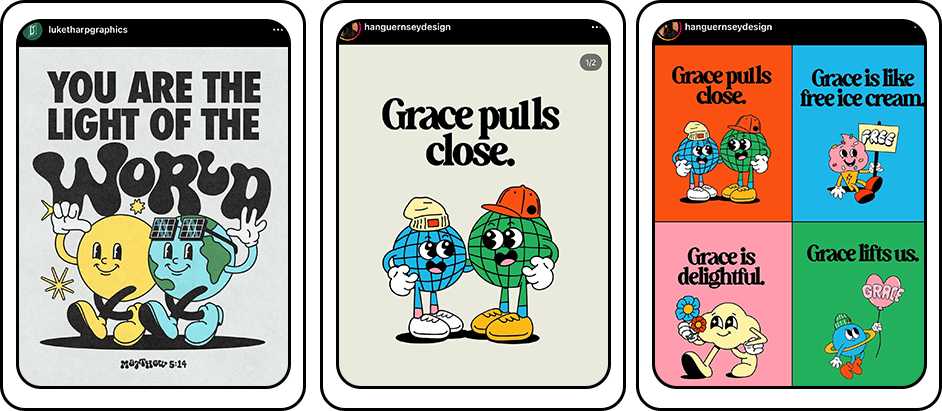
Perhaps the most specific of the design trends. But popular nonetheless. And I’m here for it!
The key is to get the right font. You need to pair it with a graffiti-style typeface.
I've got a few options for you here:
Soap by Adobe: If you have an Adobe subscription already, you'll have access to this font at no extra cost
Cheee by Adobe: I might like this one even more than Soap (for this specific application anyway).
Getai Grotesk Display: This font is free even if you don't have an Adobe subscription.
Church Facebook Ads For Beginners [2024 Guide]
10,000 people have visited churches already this year thanks to the step-by-step plan you're about to learn.
And I get it. Paid ads are intimidating.
Which is why we got paid ads expert Brady Sticker on the podcast this week.
We'll be asking him about ad targeting, creative, budget, and everything else you need to know to setup your first online campaign for your church.
Let's dive in.
Thanks as always for your time, attention, and trust. Talk to you next Thursday. - Brady Shearer


